
Website Design Fundamentals | Beginners guide
🔍 You are interested in web design and don’t know where to start.

Don’t worry, because I’ve got you covered with some simple foundations of graphic design applied to the internet.
In this case, we won’t focus on the technical or complex aspects like user experience, but rather on the basics we should pay attention to in order to develop good taste for web design.
👋🏻 Hi, I’m Dara, a designer, and the information you’ll see in this mini-course is a summary of what I’ve learned, what I think is important for beginners, and I also found very valuable information from case studies by Growth Design and the book “Refactoring UI” created by Adam Wathan and Steve Schoger, among others resources.
Remember not to take any of this as mandatory rules, it’s more of a guide with advices.
Well, let’s start.
As a website designer, your job will be to facilitate decisions for people.
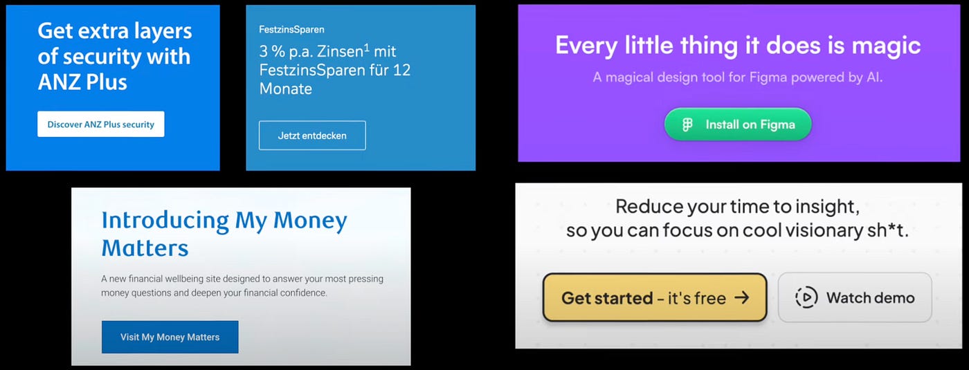
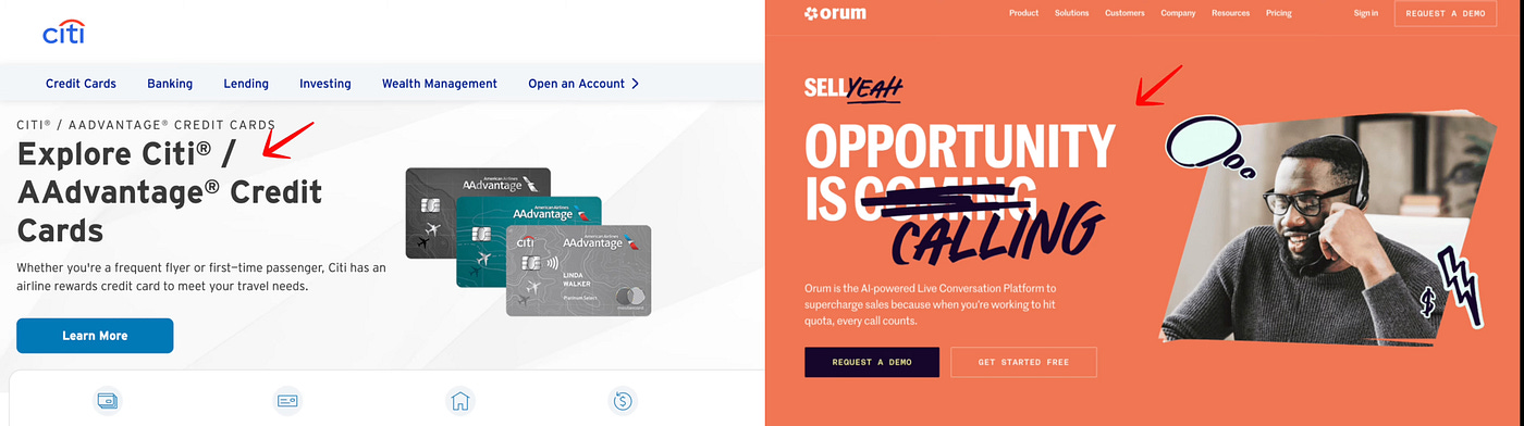
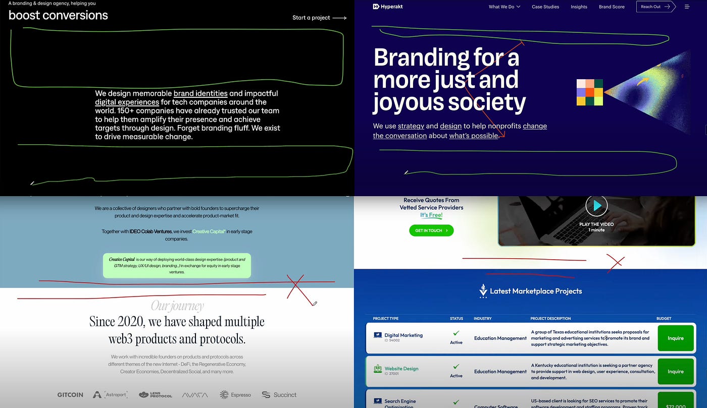
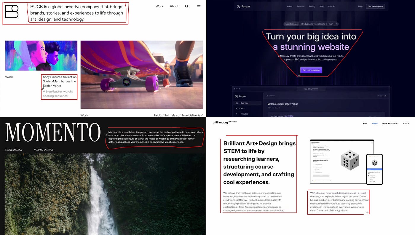
And to be able to choose more efficiently how this site should be, you should first “Choose a personality” according to the objectives to be achieved and the industry the website belongs to.
For example: A bank will have to demonstrate more seriousness, while a page with people sharing their creations with artificial intelligence can be more playful.

After determining the personality, after seeing and comparing dozens of other sites of the same industry, it will be easier to determine:
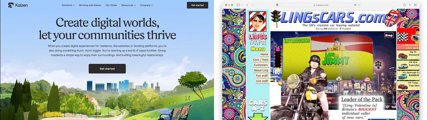
The font: this will possibly take you longer than you thought, given the number of fonts out there. If you want a classic style, you can use a serif font. If you want something more playful or cute, you can use a rounded sans-serif font; if you want something more neutral, you can use a simple one.

The colors: if you’re looking at real estate sites, or something sophisticated and expensive-looking, you’ll likely see the color gold 👑. If it’s technology or artificial intelligence things, you might see more vibrant colors like purple🦄.
Border Radius: this part doesn’t seem important, but it is. And when you choose one, stick to that decision because otherwise, the user won’t be able to quickly generate a pattern in their head to know when something is a clickable button and when it’s not.
serious vs casual
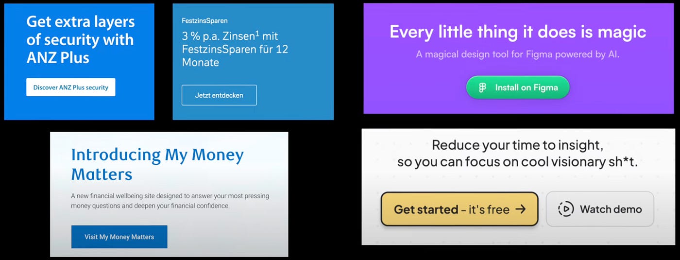
The tone of voice: maybe this is more about branding, but in the end, all graphic design is connected. I don’t need to explain too much: a bank will use more professional phrases, while other industries can be more casual 🗣️

Now that we’ve started building the website, we move on to the next lesson.
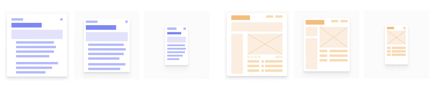
Hierarchy.
This is fundamental. You have to demonstrate which elements are more important, and if you don’t, your design will look chaotic, and no one will be able to tell quickly what the most important information is.
💡 A tip to know if the purpose of a website is clear is to do “The Squint Test”: Slowly close your eyes to intentionally blur your vision to help you see what stands out.
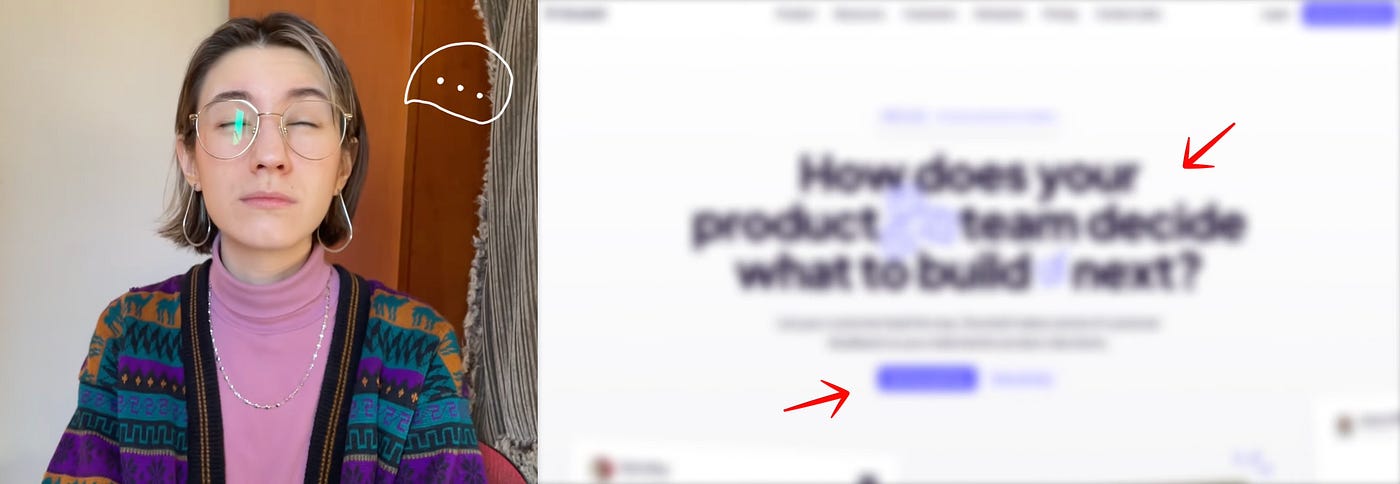
Hierarchy is not synonymous of size: just because a title is primary doesn’t mean it has to be gigantic; you can also play with weight or color. Generally, a dark color is used as primary, a lighter color for secondary content, and perhaps a very light gray for tertiary content.
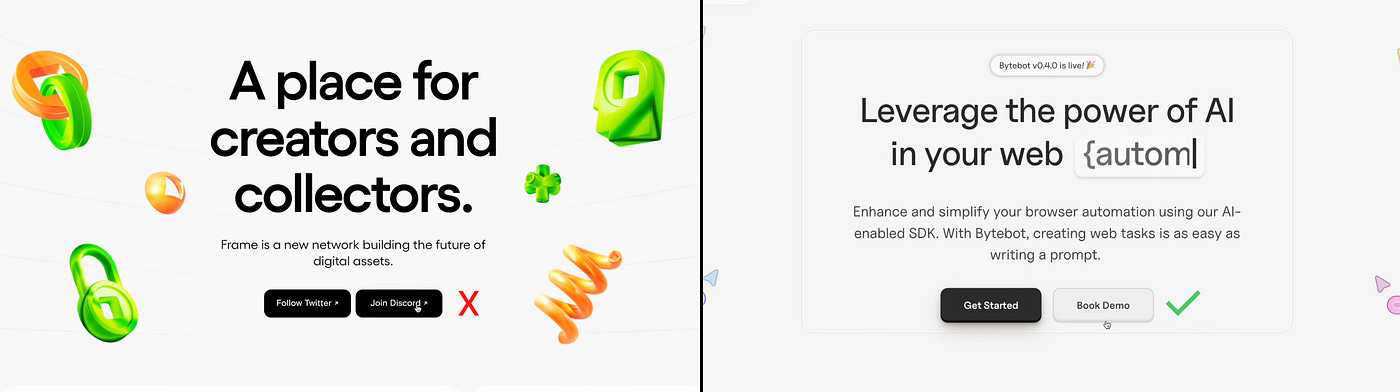
Don’t forget the hierarchy of the CTAs 🚨. CTA stands for call to action, which is the part of the website where the user is asked to take an action. If that section has several buttons to press, they must have a hierarchy.
The primary action must be incredibly obvious; we don’t want the user to spend time figuring out how it works. The secondary action should be clear but not more prominent than the primary one, and if there are other mini buttons, they should be discoverable and obvious once the user starts looking more closely. Here, the key is contrast.
Lesson number 3:
Layout and Spacing
👉🏻 Let it breathe. Let air flow through that website. It’s one of the main teachings of my first boss and mentor I had. Don’t be afraid of space.
💡 This is called the Law of Proximity: if everything is grouped together, it will be difficult to understand what is related.
Create a system of spaces and sizes 📐. How much space will there be between the title and its content, between section and section, between the elements within a section, etc.
That also includes the line height of the text, which shouldn’t be too separated but also not too close together; you need to find a balance.I love designing the desktop version first, but the truth is that it’s not the most recommended, since most users will see your page on mobile, so that’s the version you should start with 📲.
If you don’t know where to start, divide the page into a 12-column grid system and then if you need to break it somewhere, or feel it’s not working very well, you can break it and do something else, but it’s a very efficient way to start if you want to play it safe.
👉🏻 Try to generate shapes with the sections and texts. Instead of leaving a text too long, shorten it to the point where it accompanies the title.
Creating shapes with the text will help immensely visually. And if you have a lot of text, then simply align it to the left.
Don’t make the text too tiny 🔍. This is personal advice. If you find it difficult to read or have to consciously make an effort to read it, imagine someone who wears glasses 👓. And most of us do nowadays. Forget about 12px fonts — have you ever stopped to read them?
Play with shadows to understand the physics of light. If you want to elevate an element, or show it as sunken, the changes you actually have to make are very simple.
The final and, I think, most important lesson:
Don’t force it.
I’m going to tell you a phrase that I think fits very well for this moment:
“Design is like a fart. If you have to force it, it’s probably shit 💩.”
Whenever you’re doing a design and something doesn’t feel right, step away from it a bit, look at it as a whole, like a work of art. If you feel something doesn’t feel right, take it out. If you feel it’s horrible, start over. If nothing makes sense anymore, let it rest and come back to it later. Don’t force it.
So these were some super simple foundations for website design. Let me know what you think! Here you can see more of what I do daraayape.com 👩🏻💻
If you want to see more content like this, follow me on X!